The other day I was driving somewhere, and my mind was drifting (as my mind is prone to do). I got to thinking about the state of my artistic practice. My focus wasn’t on painting more or techniques, it was about marketing. I’ve always just branded my art stuff with my name. It’s a good name. I like it. I’ve flirted with adding studio, but usually Tara Choate is good enough. The downside of this is creating marketing materials. Items such as a logo or graphic are built into many sites and emails; not having a set graphic means I don’t have anything to put in those spots.
So, as I was going down the road, I got to thinking about the marketing I am planning this year. Toward the end of 2022, I learned I was accepted into the 2023 Art on the Edge Studio Tour, happening June 16-18. This is a big deal, and I want to make the most of it. This first year, my goals would be less about selling paintings than making contacts. Thus, my focus on marketing and newsletters and other forms of communication.
Back to the road. I was pondering all of this and thinking about creating a real logo and the thought drifted in that a studio name might be fun. In case I ever did something like teach classes (unlikely) or lead painting trips (also unlikely) or… well, something. What would a studio name be?
One of my favorite words, for no good reason, is the word “amok”. At work, when I am explaining I’m going on vacation, I usually say I’m going to run amok. I like the way it sounds. I like the hard K at the end. I like that it covers a lot of ground, getting into trouble-wise.
Looking up the word amok in the dictionary, it has two meanings.
- Out of control, especially when armed and dangerous (adverb)
- Being mentally unstable (adjective)
Below this is an example of its usage in a sentence.
“Do staff members try to make up for the lack of rampaging aliens by occasionally running amok themselves?” This example is from Soused at the Southpole by Giles Humbert III.
Is this not the perfect word for me?
So, I sat down and sketched out a logo. A few versions later, I’m proud to introduce my new logo, compete with a matching URL www.amokattheeasel.com.
![]()
To complete the transformation, I plan on putting out a newsletter with the new logo this weekend. The newsletter will also point out that I have modified my website to feature the logo and that now you can find the site by either typing “tarachoate” or “amokattheeasel.”
Actual Painting
Well, with all this emphasis on marketing, I’d better have something to market, right? It shouldn’t be a huge problem; my house is literally bursting with three years of painting and no events. But it’s always fun to have something new to show, and there are a few shows that I’d like to enter with deadlines coming up.
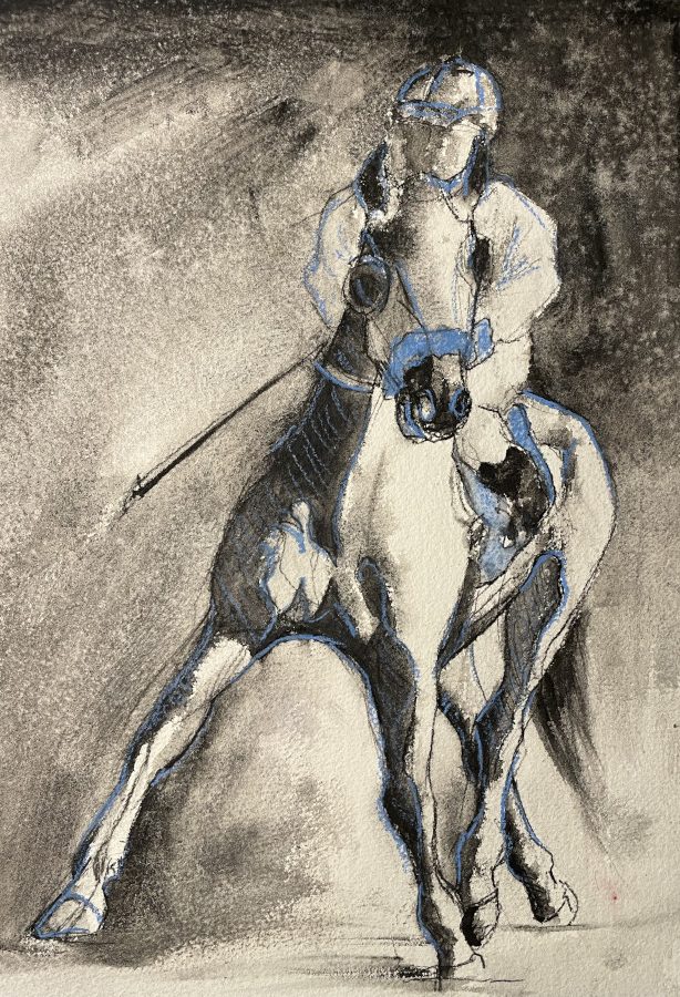
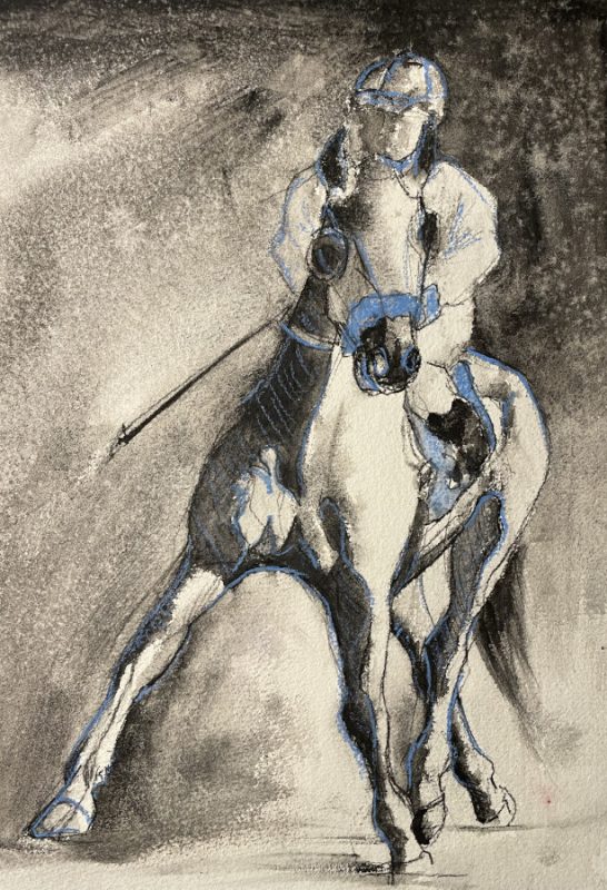
I’m still exploring liquid charcoal, but a touch of color is irresistible.
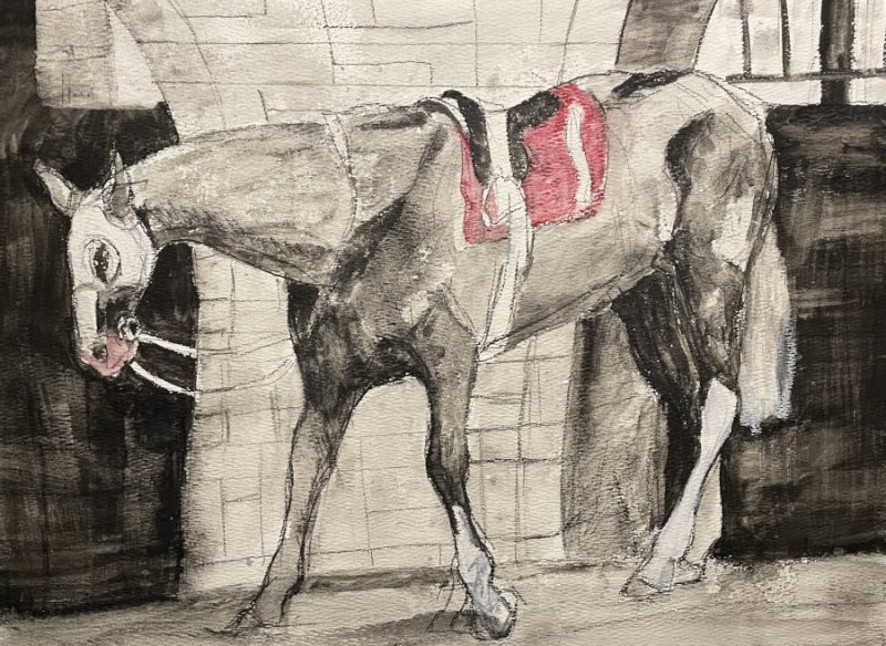
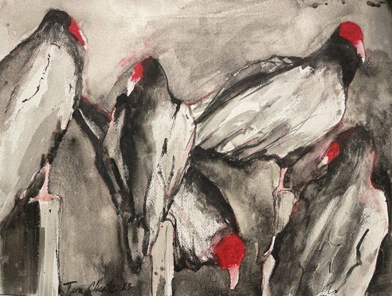
I have a few more paintings on the go, but I’m trying to only show off finished pieces this year. Not sure that’s going to work out!