As alluded to in previous posts, I have felt the need to get into trouble. I sort of forgot, I think, that that was 2020’s nickname and 2021 is still in the process of getting over the hangover. Nevertheless, I signed up for Dawn Emerson‘s workshop through the Tubac School of Fine Art. It was a virtual (Zoom) workshop, but we’ve all spend so much time like this it didn’t seem like a big deal. Actually, in the end, one of the things I really LIKED about the workshop was that it was virtual. I could get up to find a material in the studio, sleep in my own bed, generally enjoy the comforts of home without trekking across the country. Also, when I was tired at the end of the day, I could just pop into my pajamas and veg out without guilt.
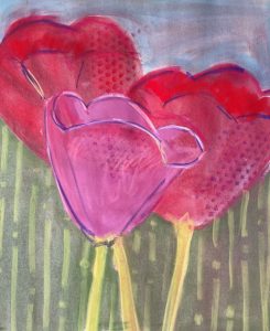
I have admired Dawn’s work for several years. I was particularly enchanted with this large piece I saw in person at a Bend Gallery.
I like the strong, active lines, the subtle palette, and the striking use of color. I also like her use of space and composition in the piece; the strong diagonal is simply left alone, uncluttered. I had purchased Dawn’s book, Pastel Innovations, but I had not yet read it with the attention it deserved. Before signing up, I had spoken to Dawn, asking if I could do the workshop in watercolor. She said that many of the exercises wouldn’t be doable in watercolor and directed me to a free video of a demo of her working with PanPastels. I was intrigued by her comment in the video about the intersection of drawing and painting and decided to sign up for her class. One of my artistic challenges is that I like my drawings, but I get frustrated with having to transfer them to painting paper before continuing.
Day 1 – Shape Drawing & Stencils
Friday at 8am I sat down in front of my computer, a folding table set up next to it, and prepared to learn. While there was the usual “hello” stuff, it was kept to a minimum and within a short amount of time we were working on a basic color wheel using the PanPastel and listening to a talk on color theory using this luscious painting by Tibor Nagy.
Obviously, this is an analogous color scheme. But what I was fascinated to find out is that there are specific “discord” points that make this painting pop (specifically the touches of purple and green, in this painting.) Dawn showed us a color wheel that I had not seen before (The original Analogous COLOR WHEEL by Hal Reed) and I’m considering tracking one down.
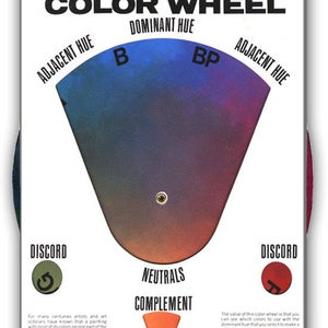
For the first time, I felt comfortable using an analogous color scheme because I could see how MANY colors were available.
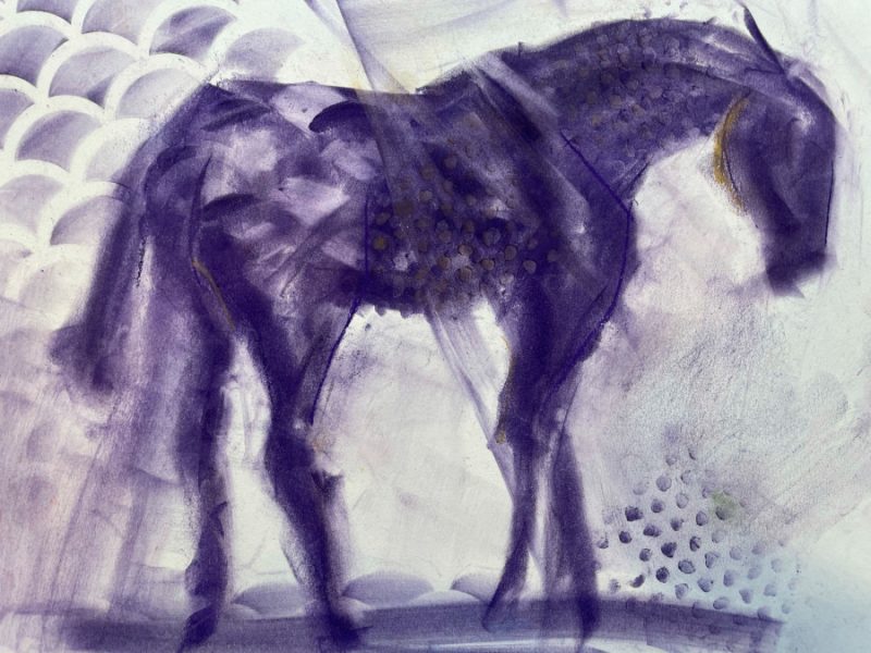
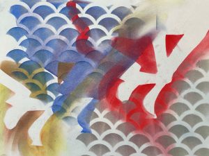
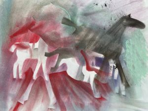
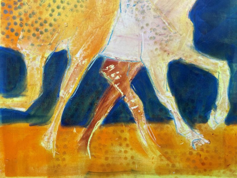
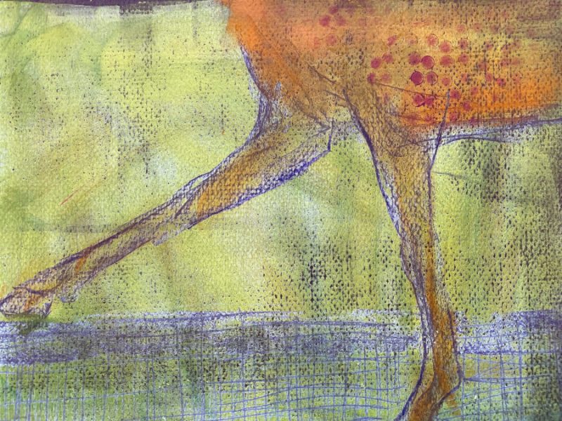
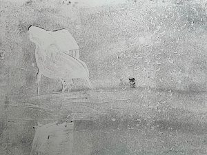
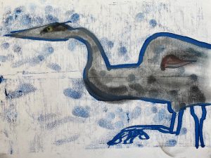
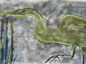
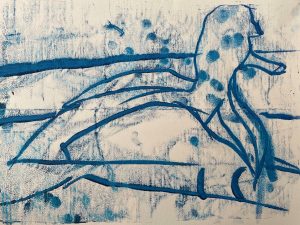
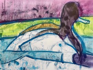
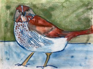
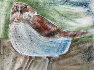
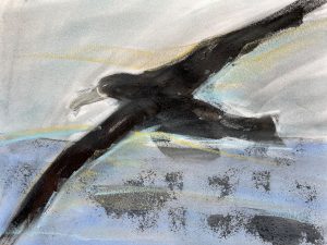
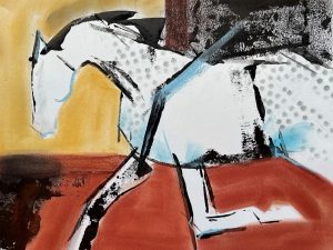
Next, we worked on a basic study in using the PanPastels using a reference photo of a sculpture by superlative sculptor Deborah Butterfield. The idea was to get used to the medium and also to work on big shapes. We were also urged to use stencils to embellish, which I did (though not terribly effectively.)
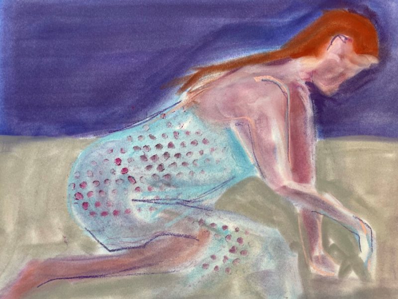
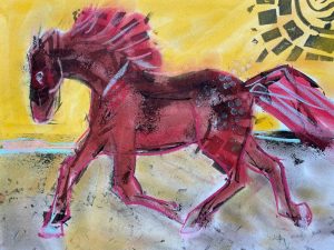
We moved onto (human) figures and the group groaned at the reference photo. With a smile, Dawn made us dig in. With a few strokes, we were able to evoke the image and soon the group was worrying about perspective and color choices.
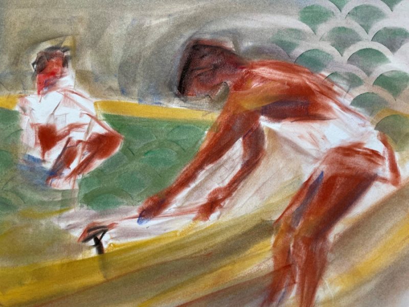
Another figure was presented, and again came together quickly, in spite of the difficulty of the reference photo.
After this we took a lunch break, then returned for a work session where we were encouraged to develop our own stencils and use them to tell a story or poem.
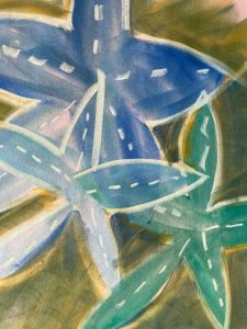
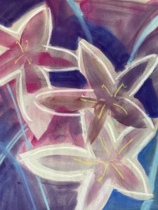
I liked this exercise a lot, though my results were not great. When I have more time, I’d like to go back to this. I was particularly intrigued by a couple of Dawn’s comments. First, she pointed out that this use of stencils was a great way to start and explore a series. A unique stencil is something the viewer will instantly recognize, leaving the artist free to work on the ideas around the image, rather than the the details of (again) creating a subject. Second, she encouraged the group to consider the possibilities of using a stencil to illustrate a book or similar, multi-image work. Finally, she pointed out that this is a good way to provide collectors a lower price point, if that is an issue, because the stencil images come together so quickly. Cards are even a possibility.
Day 2 – Direct Line Drawing & Subtractive Monotype Printing
At the end of the first day, we sent in our images to Dawn via email and she presented them in a digital slide show, offering critiques and answering questions. After this, we explored various print-making methods.
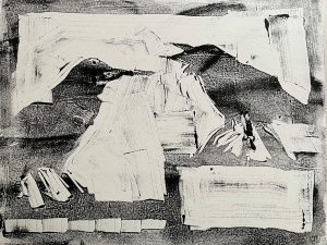
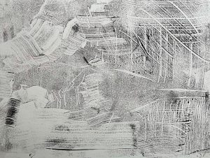
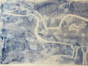
First, we tried what was called “direct painting with white water mixable oil onto colored paper+PanPastel”. Basically, this method was about making marks. Select a smooth, colored piece of paper as close as possible in color to one of your PanPastels. Brayer white oil paint onto the paper. Cover the image with the matching PanPastel and then use a tool such as a razor blade to “carve” out marks. This can create a fun “in-and-out” look.
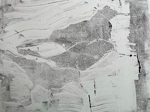
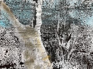
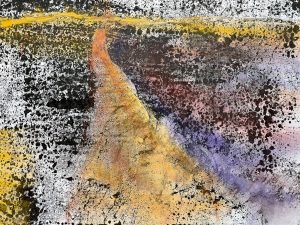
This was my first attempt, and it has many problems, poor composition being among the most egregious. For my next attempt, I neglected to follow instructions and used a textured paper. The result was not displeasing, but not ideal either.
I’d like to come back to this and try it on some marbled papers, but I was glad to move on to a different technique: subtractive monotype printing.
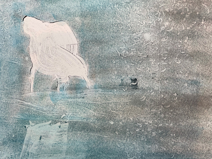
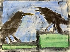
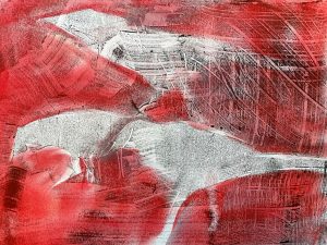
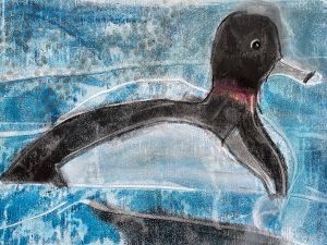
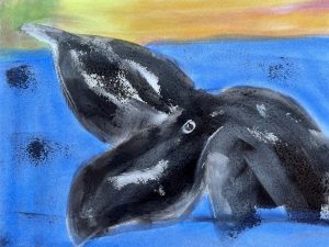
As before, we used oil paint (black this time) to cover a field, such as a glass plate or (in my case) a piece of acetate. Then we scraped off the paint we didn’t want to be black, applied the plate to the paper, and had an image that we could enhance with PanPastel. While I liked this, I did have an issue with my paint. I had not purchased oil paint before the class, hoping there would be an alternative. During day 1, Dawn indicated that oil paint really would be best, so I went down to the store and found an inexpensive set of student oil paints. The reason they are “student” grade is because in order to make them cheap, they don’t put a lot of pigment in the paint. So, my monotypes were more washed out than desirable.

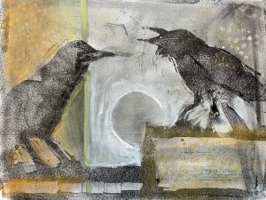
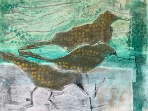
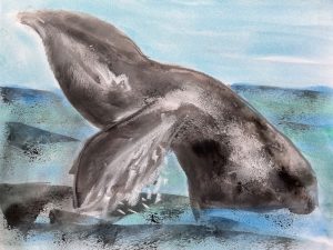
This was my first attempt. As you can see, I forgot that would you carve out is white, not black. It made an unexpectedly good work, maybe my favorite of the workshop. (Note: Thank you Liz Walker for encouraging me to use the referenced photos from this blog post.)
I could have gone on all day with this technique and I’ll come back to it. I did some brief experimenting with acrylic and a Gelli(r) plate. I don’t see any reason why it wouldn’t work. And then… no oil paint cleanup!
Day 3 – Trace Monotype (oil) & Brayer Drawing
Once again, we sent in our images to Dawn and she presented them in a digital slide show. It was clear that I wasn’t the only one enjoying the class, but it surprised me that some people were better (or at least more drawn) to some techniques than others. Later, Dawn made a comment to a couple of different people about where their “magic” was, referring to the techniques we were using. I didn’t ask where my “magic” was, but I wish I had. On the other hand, I don’t suppose it matters. What draws me and what I work on is what’s important, not what someone else says.
By now, the mood of the group was becoming more ambitious. Dawn started us out with trace monotypes, a method of applying paint (or some other media) to a less-adhesive surface and then drawing or tracing the desired image onto the face-down surface onto a surface. While some people instantly “got” this, Ii was not one of them. It was messy and my fingerprints went all over everything.
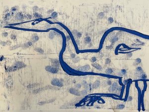
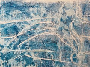
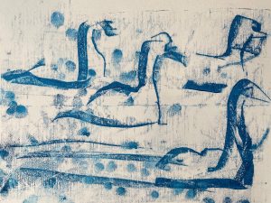
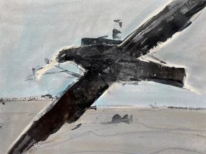
Thankfully, at this point, we moved on. Notice I didn’t do anything with “Swans” it was such a bad attempt.
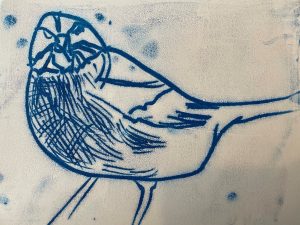
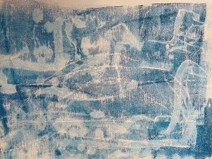
While my skill needs improvement, I enjoyed brayer drawing much more. For those who don’t know, a brayer is a tool that my dad used to call a wheel-ie-ma-bob.
I used two different brayers: a foam brayer and a rubber brayer (similar to the one above). I also used black acrylic paint as opposed to oil.
Conclusion
Years ago, when I was doing more dog training, I heard someone remark that she had learned something from every workshop she had ever taken. Sometimes she had taken home a lot, sometimes a little. But there was always something that made it worth attending.
This workshop had a lot to recommend it. The format was well thought out. The teacher knowledgeable. The participants engaged and (this is a first for me) there wasn’t that one student who believed there were “no stupid questions” (there are.) Everyone was pretty good about muting themselves (scratching pencils are surprisingly loud on Zoom). As I said before, as I was in my own studio, I could go searching for “that thing” whenever I needed it. And home is still the best place to be.
My only criticism (and it’s not really is a complaint) is that, in her own words, Dawn used a “shotgun” approach. She concentrated on showing us a lot of techniques and options instead of working on the basics I was hoping for, such as color and composition. This provides me with a lot of opportunity to experiment and additional tools in my box, but not a notable improvement in the skills I struggle with.
But magic doesn’t happen overnight, and it’s a very individualized process. Workshops help you explore, they don’t provide a map.