
Occasionally, when I make a comment about my work, indicating something isn’t right (or just flat-out wrong), my non-art friends will accuse me of being too hard on myself. While there may be some truth to that, I usually find it a perplexing and frustrating comment. [Author’s note: While I’m not advocating tying a schoolchild to a piano bench, where is the harm in pointing out a wrong note or flawed technique? While children need to be supported, they also need to be taught the value of constructing criticism. Or so I would think. I don’t have children, so taking my parenting advise obviously has some flaws.] I’ve written about critiques or critique groups before, but I’m going to go over the process of reviewing a painting that just didn’t turn out.
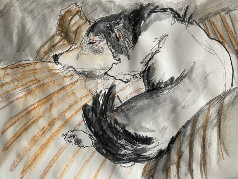
Last week, during Nora Sherwood‘s excellent drawing and shading class, I created a sketch of my dog, Key, that I liked so much I decided to add color. And then I decided to paint on real watercolor paper, etc.
In order to transfer the image, I added watercolor crayon to a sheet of parchment paper, then used a stylus to go over the original drawing, with the color parchment between the sketch and the watercolor paper. Like a piece of transfer paper, but with a softer edge.
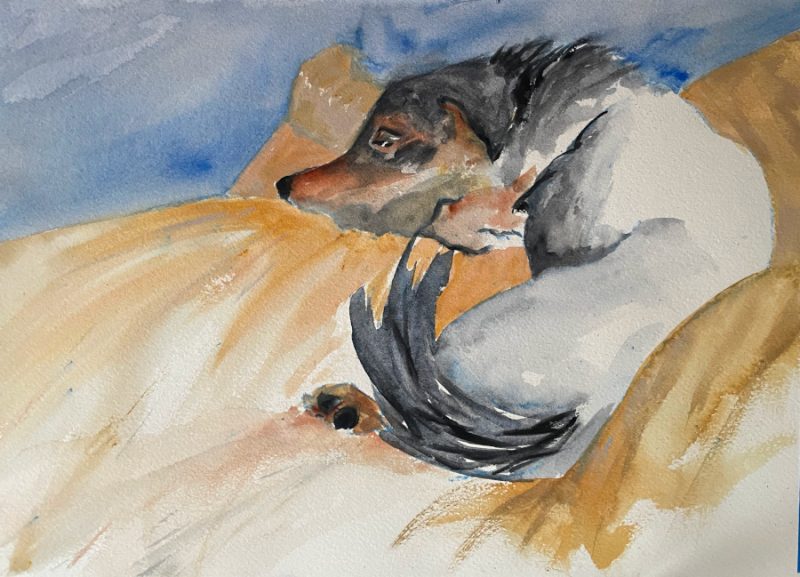
I wanted to keep the dog black and white with just a touch of warmth, like the sketch. And I wanted a warm-colored bed, and I think this ochre fits the bill. But otherwise, it is not really what I wanted. As I have studied the painting over the last week, I think there are two basic flaws.
Flaw 1: Value
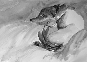
The biggest issue around value is the dog’s face. In the painting, it has too much color. In the study, the black tail arrowed up to the white face, emphasizing the theme. In the watercolor, the face is actually quite dark.
The second issue is that the stripes in the original study also lead the eye to the white face. The gestural marks are “read” as gestural, not sloppy.
Flaw 2: Color temperature
I toyed with doing the whole painting in blues and grays. For me, blue is a safety and love color. The white face would lend itself to gray undertones. But I wanted the gray dog temperature to be a nestled in a warm bed. The two sets of colors read as atonal, like a European listening to Japanese music. It isn’t that traditional Eastern music isn’t nice, it’s just not usually pleasing to an uneducated Western ear.


Because i was working with flat, non-toned charcoal (or possibly water-soluable graphite) in the study, the hints of gold created an overall warm. In the painting, I used a blue-toned charcoal along with a cool blue background; this created a dissonance in the overall work.
I’m not sure about the next steps, if any. But I’m glad I took the time to figure out the problem. Now, if I can just avoid repeating it 100 times.
In other news
In other news, I was sick several days this week (food poisoning, then allergies with a new, old-age bonus of nosebleeds.) As such, I wasn’t feeling inspired in Nora’s final class today. This is a shame, but I’ll try to work hard on value in the future.
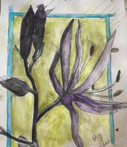
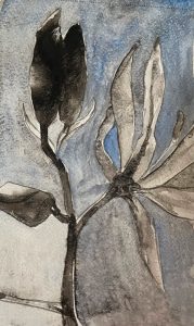
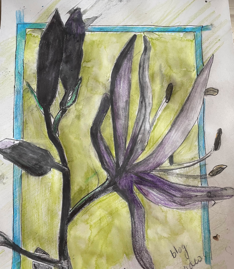
The above are doodles I worked on while listening to the class and talking to my friend, Mary Margaret, who again joined me.