In September, I participated in a 30 Paintings in 30 days challenge and made it to day 27 before it kind of fell apart. On Labor Day I did a painting of my cat Bella lounging around in the sun; it caught the attention of my friend Charlene.
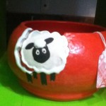
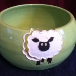
 Charlene and I worked out a barter: a painting of her friend’s cats in exchange for a couple of her exquisite yarn bowls. I had one at one time, but I broke it. 🙁
This is not the first time I have worked “on commission” or copying photos, but I decided to take pictures of the whole process for two reasons: 1) I read an article about improving your art by taking pictures of your process, and 2) I could turn into a page on my site explaining my process.
Step 1: The Guidelines and Selection
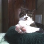
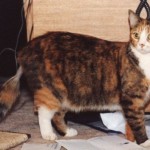
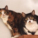
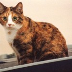
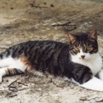
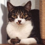
Charlene was commissioning her painting for a male friend who liked “simplicity” and “detail” and “blue”. She provided me with a variety of photos from her Facebook page of my subjects, Targus (I believe the darker one) and Zoot (the oranger one).
I was immediately captured by the photo of Targus with his foot close to the camera and Zoot lying on the pillow, but I decided to take them all home before making a decision about what to do.
At home I played around with a variety of ideas. I think Charlene was thinking about one painting with both cats; however, the only photo where the cats are together had an awkward layout and presented both cats straight on. I didn’t think it would make a good painting, even with tweaking. I played around with combining the other photos, but the photos that showed the most of the cats didn’t seem to demonstrated any personality.
Finally I decided to do a dyptic with the photo of Targus on the ground and Zoot on the pillow and use a similar background to relate the two paintings.
Step 2: Design & Set Up
I printed out the photos to the size I wanted, then traced the photos onto a piece of paper. Originally I thought I would try to fit all of Targus onto the painting, but I quickly realized the paintings would be more pleasing if the cats were the same size, even if that meant cropping off some of the cat.
Because I wouldn’t be matting and framing these pieces myself, I designed the paintings to fit into standard 10″x13″ mats that would fit into a 16″x20″ frame. These mats and frames are readily available and come in a wide variety of styles, suitable for any taste.
Step 3: Background
With my guidelines of “male”, “simple”, “detail”, and “blue” I decided to do a simple wash of blue and gray as the background. I thought that adding the gray in Targus’s painting would evoke the ground and blue in Zoot’s painting would evoke the pillow.
 I was also careful to leave some streaks and connections between the two paintings; whether the paintings were hung side by side, vertically, or individually, I wanted the viewer to unconsciously connect the two subjects.
Step 4: Selecting the main body wash
As I am sure you have noticed, the cats are not the same color; however, they are very similar in their tones, markings, shape, and eye color. I wanted to preserve that by using a limited color palette on the cats themselves. I knew the gray I used in the background wash would serve as my “black” but I had more trouble deciding on how to convey the overall warmth of Targus’s coloring with the brightness of Zoot’s.
 I decided to add brown to Targus’s undcoloring of gray and the same brown to Zoot’s yellow; I tried to pull the yellow into a few areas of Targus. In retrospect I wish I had bumped up the brown on Targus, especially after what happened a little later in the process.
Step 5: The Details
From here, it’s all about details. The first set of details is pretty obvious–I added markings and adjusted the values.

 And then adjusted a little more.

 Step 6: Critique Group
At this stage, it was time to take the paintings to my new critique group. I knew they weren’t done, but I wasn’t exactly sure what the next step was. They suggested a few dark whiskers to emphasize the light ones, “pushing back” Zoot’s rear legs, “pushing back” Targus’s off side front leg, and adding more shadows underneath both cats.

 Step 7: Delivery?
I was trying to hit a Christmas delivery, and I was pleased at this point, so I contacted Charlene and we made a date to meet at Michaels for delivery and frame selection.
This is the part of the story where I want to be both truthful and tactful.
Charlene took one look at the paintings and I could see by her face, even before she said the words, that something wasn’t right with her. My immediate thought was, “Oh my gosh, why didn’t I send her a picture of them before we got to this point?”
With great delicacy, Charlene said, “On Targus–he’s not that color. He’s more chocolate.”
Now, my first thought (and maybe my first words) were along the lines of, “But he is in the pictures.”
Charlene whipped out her cell phone and brought up the pictures. And while I didn’t exactly agree (arttistically I had heightened the contrast of the tabby) I could see her point. I could imagine petting a chocolate tabby cat instead of a gray tabby and not being willing to settle for an artistic interpretation.
Then Charlene said, “And his eyes aren’t quite right. They were more round.”
Here, I could immediately see what she was talking about. I had noticed that both cats were sturdily built with round, protuberant eyes. Because of the photo I selected on Zoot, that wasn’t so obvious, but Targus’s photo could be bumped up to emphasize this feature.
I quickly made a list and agreed that these traits could be fixed. Charlene headed over to frames and I showed her the selection of mats and frames and showed her my marks where the paintings should be cropped. Charlene seemed surprised how much better the paintings looked matted and framed, and we agreed to exchange pictures prior to meeting up again.
Step 8: Crossed Eyes
At home these fixes, including a small (requested) revision of Zoot’s pillow, took about three days of thinking and 10 minutes of doing.
So, I submitted the photos for Charlene to examine.
Charlene liked the changes, but asked for one more: she thought Targus’s eyes were crossed.
Step 9: Fixing One Stroke
As far as thinking this step took me the longest. Fortunately, Charlene said her friend was out of town which gave me some extra time.
The deal with eyes is that they are either immaculately planned out or they are one quick (hopefully perfect) stroke.
For these pieces, I wanted the eyes to have a lively life, and I had gone for the one stroke approach.
I went back to the photo of Targus and examined his eyes: were they crossed in the picture? Had I copied he photo itself?
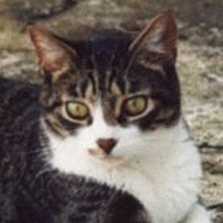 Looking at the photo, Targus is focusing intently on something in front of him. His eyes are a little “crossed” because of this, but in the photo it comes across as simply tracking.
I went back and looked at my piece.
I honestly felt that I had been accurate; and I also knew that this was something that if it hung on Charlene’s wall she would ALWAYS notice and it would destroy the painting.
So I redid the eyes. I scrubbed out the pupil and added a layer of yellow, happily bringing more intensity to Targus’s gaze. Then I carefully redid the pupils, being careful to move them over just enough to convey the forward tracking without replicating the cross-eyed-ness.
 The color on this is very bad, but I think the overall effect is improved; Charlene agreed and took delivery on Saturday.
Step 10: Conclusion and Post-mortem
I am hoping Charlene might send me a photo of these matted and framed so I can see “the end” of this project, but I’m not counting on it. I rarely see my paintings in their final home.
But this process was valuable to me. I learned a lot of lessons for doing a commision.
- ALWAYS send a picture for a pre-approval
- Accept the buyer’s critique
- Find out what color the buyer thinks the animal is / don’t just accept a photo
- When working on deadline, give yourself some extra time to fix things
- And finally, remember this: “A portrait is a painting with something a little wrong with the mouth.” — John Singer Sargent (1856-1925), American painter of many portraits.
