The idea of the big paint out is to paint on a big canvas–but that is just a suggestion, not a requirement. ~ Celeste Bergin, Alla Prima Portland
I went to bed last night with two possible plans. Plan A: Stick around the house, do some more painting, possibly break out my new marbling kit. Plan B: Attend the “Big” Paint Out at Sauvie Island hosted by Alla Prima Portland.
Sauvie Island is about an hour an a half from me, and I really thought I would wake up and decide to be lazy. The biggest thing going for the paint out is that my friend, Sandra Pearce, was going to be there. But when I woke up this morning, I knew just where I was going.
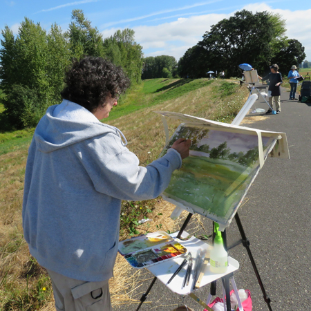
Sandra Pearce at the paint out
I threw the painting stuff in the car (I didn’t forget that, but did forget lunch and the requirements to do a small errand while I was in Portland) and hit the road.
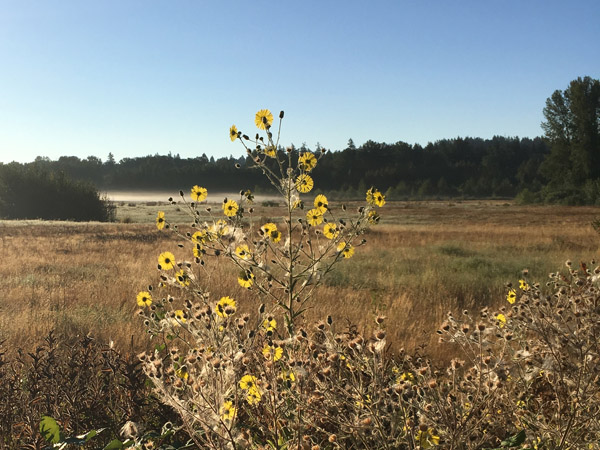
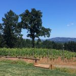
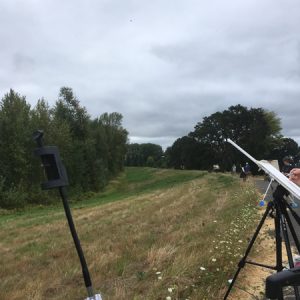
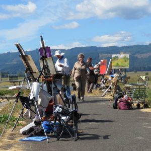
I’ve been out to Sauvie Island several times for the Audubon Society of Portland’s Raptor Road Trip in February, so I was familiar with the meet up area. Between you and me, I was a little surprised about the choice of Coon Point (also known as the Sauvie Island dike) for the paint out. In my opinion, there are prettier places. But there is ample parking, portapotties, and handicapped accessible trails. I’m sure that’s why it was chosen.
I was a little surprised by how many painters showed up. I counted 34 at one point, the “official” estimate was 33. The list of artists on Facebook included these names (31 including me, if you’re counting):
- Anna Lancaster
- Becky Land
- Brenda Boylan
- Celeste Bergin
- Chris Wood Rectenwald
- Don Bishop
- Jaqueline Hamer Lukowski
- Joyce Sloan
- Judy John Shaw
- Ken Klos
- Kimberly Kent
- Marti Brandtner
- Michael Lindstrom
- Michael Orwick
- Michele Bufton
- Nancy Smith Klos
- Paul Zegers
- Raphael Schnepf
- Robin Laughlin
- Sandra Pearce
- Sharon Abbott-Furze
- Stephanie Cissna
- Sue Berg
- Tim Young
- Tom Daniels
- Tom Kane
- Vicki Zimmerman
- Ward Jene Stroud
- Yong Hong Zhong
- Za Vue
What I’m trying to make clear is there were a lot of painters.

So with creativity thick in the air, I sat down and looked around. The wind was blowing and it was overcast. This was a change from Salem where it had been bright and sunny; frankly, I was a little under dressed. But I took out my sketchbook and started on a few ideas. I had decided to take the challenge to use a big surface seriously, so I had come prepared with a 1/2 sheet and a full sheet of watercolor paper.
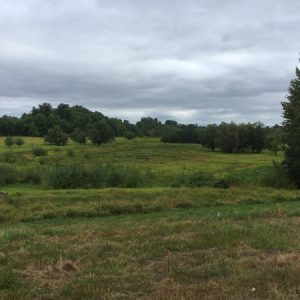
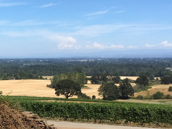
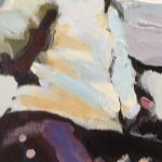
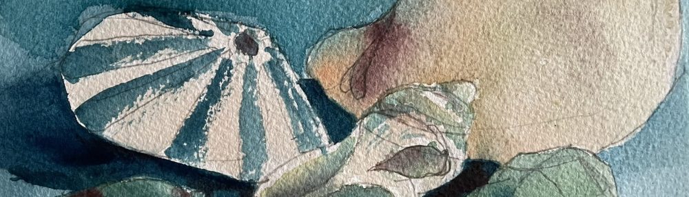
I had put down the first layers on “Coon Point, Sauvie Island” (reference shot 1 above, painting below) and I was just getting started on painting number two. It was scheduled to be the dry marsh in shot 2 above. Then the clouds started going out. For about five minutes the skies were really dramatic. I had made a few light marks on my paper, but I mentally said the heck with it, flipped the painting upside down and painted the sky.

“Clouds Going Out” – 30″x22″ cold press Arches
Wow, looking at that, it’s really light. I need to emphasize this is just one layer of paint.
In fact, this is so light I went into the studio just now and took a second photo in there.

“Clouds Going Out” – 30″x22″ cold press Arches
Huh. Well, that’s not quite right either. But you get the point.
On site, I have difficulty seeing values and adjusting accordingly. I could tell at this point that I liked where this painting was going, but i wasn’t sure where to go next. So I put down my brushes and did a little tour of all the other painters.
-
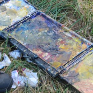
- I love this messy palette
-
- A plethora of equipment
-
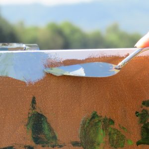
- Palette knife painting
-
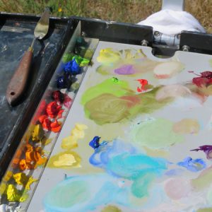
- Such a pretty palette
I’m never sure just how Facebook groups work, but if you are really interested in seeing the paintings, go to this album at Alla Prima Portland.
After seeing the amazing paintings other artists were doing, I came back and made a second pass at my first painting. I’m having the same problems with color accuracy here, but I think you can get the idea.

“Coon Point, Sauvie Island” – 15″ x 22″ on cold press
Remember, this painting was started during the cold, overcast morning. Anyway, I’ll figure it out.
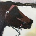
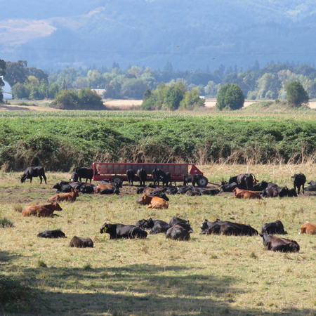
The nearby cows featured in many of my fellow artists paintings. I almost borrowed another sheet of paper from Sandra to do my own cow painting, but it was getting late and I hadn’t had lunch.
So after the group did a guided tour of all the other paintings, I packed up and wished the amazing Sandra luck (she’s a painting MACHINE) and headed home.
It was a good day. I’ve been painting pretty small lately, so painting big felt good. In face, I wished for a bigger brush! It’s an interesting point in light of yesterday’s post.